cantina mandia.
framed in 1960. based in today. blessed for tomorrow.
Inspired by the frames of cinema in the 1960s era. From then until today.
In an ever-changing environment of fleeting trends, art deco has remained relevant even after a century in creative culture.
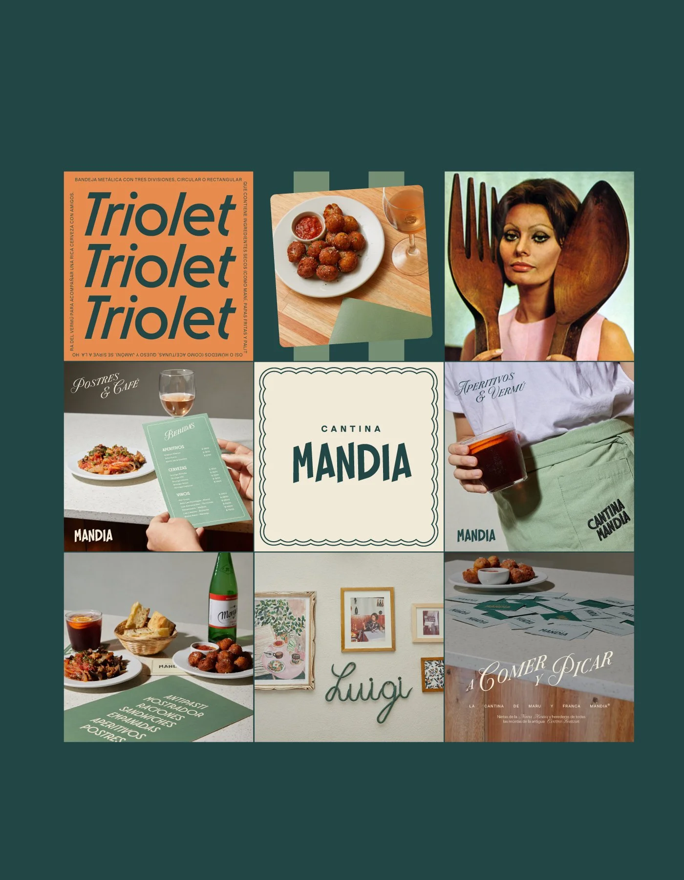
Cantina Mandia sought a contemporary wordmark inspired by the art deco style of the 1920’s, incorporating the thick, diagonal illustrative elements and evoking the lively Italian spirit of Tarantella, a fast, upbeat folk dance and music ritual originating from southern Italy.
‘This blend of unique elements conveys the spirit of the era in a modern way.’
The orange-green hues evoke a relaxed colour palette derived from images of Sofia Loren; one of the great Italian Hollywood stars of the golden age, decorated throughout the venue. All related to food & leisure, the wall-hung images style an interior truly reminiscent of Hollywood’s golden age with an romantic European twist.
Still seeking a feminine touch, many frames included slight nods of folder trimmings and fabric napkins embroidered by grandmothers with an added minor script typography reminiscent of romantic movie titles.

Two shades of green. Two shades of gold. The colour of nature with Hollywood’s golden age.
With a typographic set of strong, bold diagonals and a minor script with romantic features from Hollywood’s golden age, the colours needed to represent Cantina Mandia in what it stood for. Golden-orange highlights in a world of nature; the Buenos Aires favourite in Italian late nights holds a special signature green of its tropical surroundings.


