go nude.
where science meets nature. refillable, affordable, home-care.
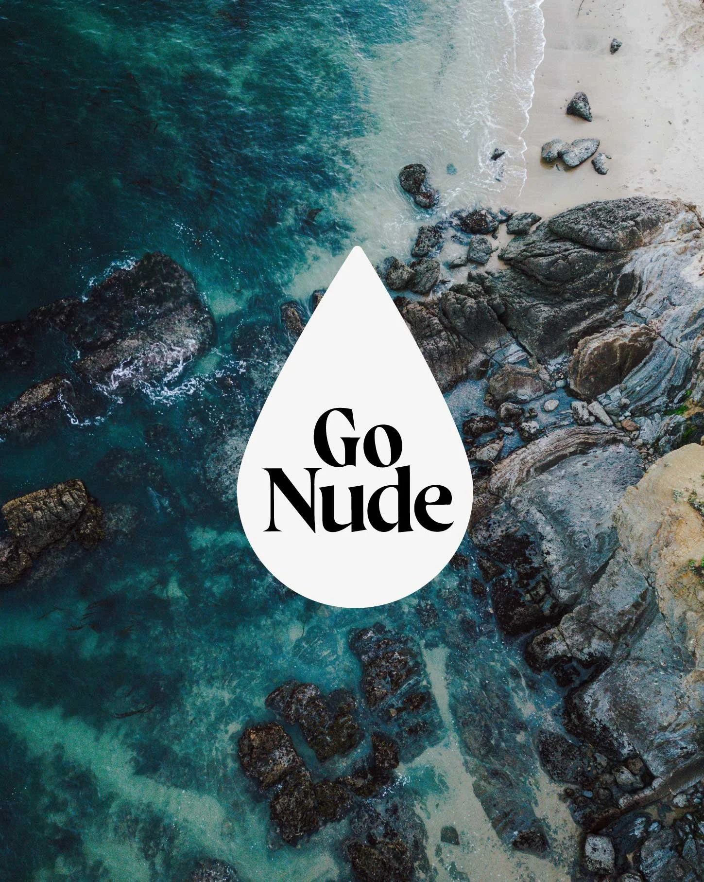
Go Nude set out to establish an identity communicating purity, sustainability and connection to the natural world.
Inspired by the fresh water of the Murray-Darling Basin, one of Australia’s most essential resources, Go Nude’s visual language was designed to reflect clarity, transparency and harmony with nature.
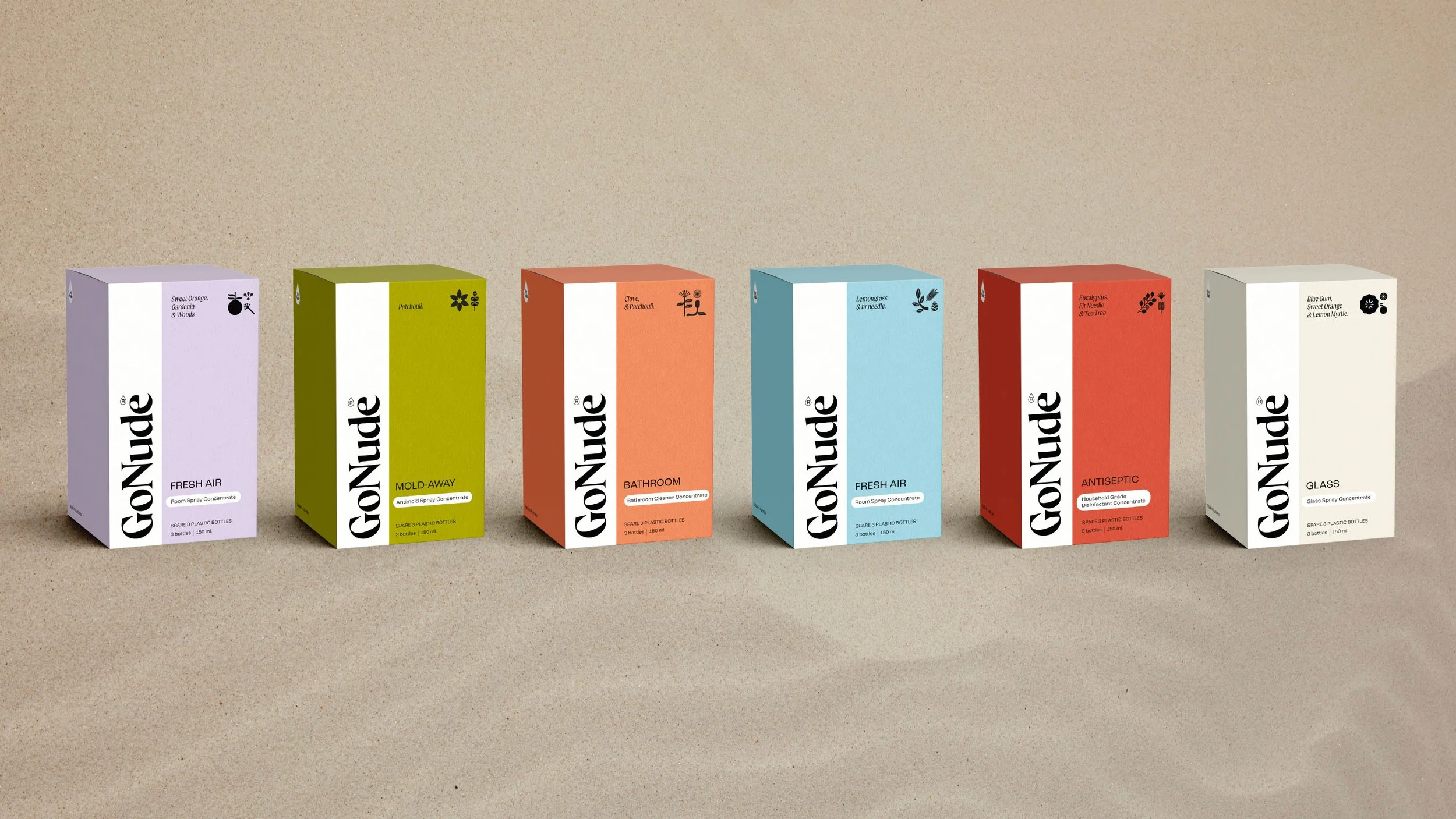
The logo centres on a minimalist water droplet, symbolising purification and unity. A clean and modern aesthetic was chosen to reflect the brand’s focus on natural beauty and conscious living. The colour palette, drawn from the intersection of water and earth, features soft neutrals and muted tones to evoke an organic, grounded presence.
A custom set of icons were developed to represent natural ingredients, emphasising simplicity and environmental respect. These minimal illustrations support both functional and visual communication across packaging and marketing materials, reinforcing the brand’s values in every touchpoint.
Every design element was produced with a clear intention to support a mindful, earth-centred philosophy. The final result is a cohesive and evocative identity positioning Go Nude as more than a product brand, offering a lifestyle anchored in simplicity, self-awareness and environmental consciousness.